The Google Workspace Icon Redesign Explained: Strategy, Branding, User Experience, and Industry Impact
For millions of people, the colorful icons of Gmail, Drive, Docs, Sheets, Meet, and Calendar have become part of everyday work. They appear on laptops, smartphones, browser tabs, and office dashboards countless times throughout the day. Because these icons are so familiar, even a subtle design change can trigger strong reactions.
That is exactly what happened when Google introduced its Google Workspace icon redesign.
What initially appeared to be a simple visual refresh quickly became a broader conversation about branding, usability, product ecosystems, and the future of workplace software. Some users praised the cleaner and more unified look. Others argued that the new icons made it harder to distinguish between apps at a glance.
The debate highlights something many organizations overlook: design is not merely decorative. Visual identity influences recognition, efficiency, trust, and even user behavior.
Understanding why Google redesigned Workspace icons requires looking beyond aesthetics. The redesign reflects Google’s larger vision for Workspace, cloud collaboration, cross-product integration, and platform consistency.
This article examines the reasoning behind the redesign, the design principles involved, the benefits and criticisms, and what the change reveals about the future of digital productivity platforms.
Understanding Google Workspace and Its Visual Ecosystem
Google Workspace is Google’s suite of productivity and collaboration tools used by individuals, businesses, educational institutions, and government organizations worldwide.
The platform includes:
- Gmail
- Google Drive
- Google Docs
- Google Sheets
- Google Slides
- Google Meet
- Google Calendar
- Google Chat
- Google Forms
- Google Keep
- Google Sites
For years, these applications maintained unique visual identities. Each icon had its own dominant color and distinctive shape.
Examples included:
- Gmail’s recognizable red envelope
- Drive’s green-yellow-blue triangle
- Calendar’s blue square
- Docs’ blue document icon
- Sheets’ green spreadsheet icon
This approach made individual products highly recognizable.
However, as Workspace evolved from a collection of separate tools into an integrated productivity ecosystem, Google began reevaluating whether the old visual language still reflected its strategic direction.
Why Google Redesigned Workspace Icons
The redesign was not simply about modernizing graphics.
It was driven by several broader objectives.
1. Creating a Unified Product Family
One of Google’s primary goals was strengthening the perception that Workspace applications belong to a connected ecosystem.
Historically, users often thought of Gmail, Drive, Meet, and Docs as separate products.
Google wanted users to see them as interconnected components of a single productivity environment.
A consistent visual language reinforces that perception.
When icons share similar shapes, gradients, and colors, users subconsciously associate them with one broader platform.
This principle is common among major technology companies.
A unified design system communicates cohesion and integration.
2. Reflecting Cross-App Collaboration
Modern work rarely happens inside a single application.
A project might involve:
- Gmail communication
- Calendar scheduling
- Meet video calls
- Drive file storage
- Docs collaboration
- Sheets reporting
Google Workspace increasingly encourages fluid movement between these tools.
The redesign visually reinforces this interconnected workflow.
Rather than presenting apps as isolated destinations, the icons suggest membership within one collaborative environment.
3. Aligning With Google’s Brand Identity
Another major factor was alignment with Google’s corporate branding.
The redesigned icons incorporate Google’s signature color palette:
- Blue
- Red
- Yellow
- Green
These colors are deeply associated with Google’s master brand.
Using them consistently across Workspace creates stronger brand recognition.
From a branding perspective, this approach offers several advantages:
| Benefit | Impact |
|---|---|
| Stronger brand consistency | Easier recognition |
| Ecosystem awareness | Users connect products together |
| Visual cohesion | Cleaner product family appearance |
| Marketing efficiency | Unified messaging across services |
4. Supporting Material Design Evolution
Google’s design philosophy is heavily influenced by Material Design.
Over time, Material Design evolved toward:
- Simpler geometry
- Layered depth
- Consistent spacing
- Adaptive interfaces
- Cross-platform usability
The Workspace icon redesign aligns with these broader design principles.
Instead of relying on older skeuomorphic cues or highly individualized icon styles, Google adopted a more systematic design language.
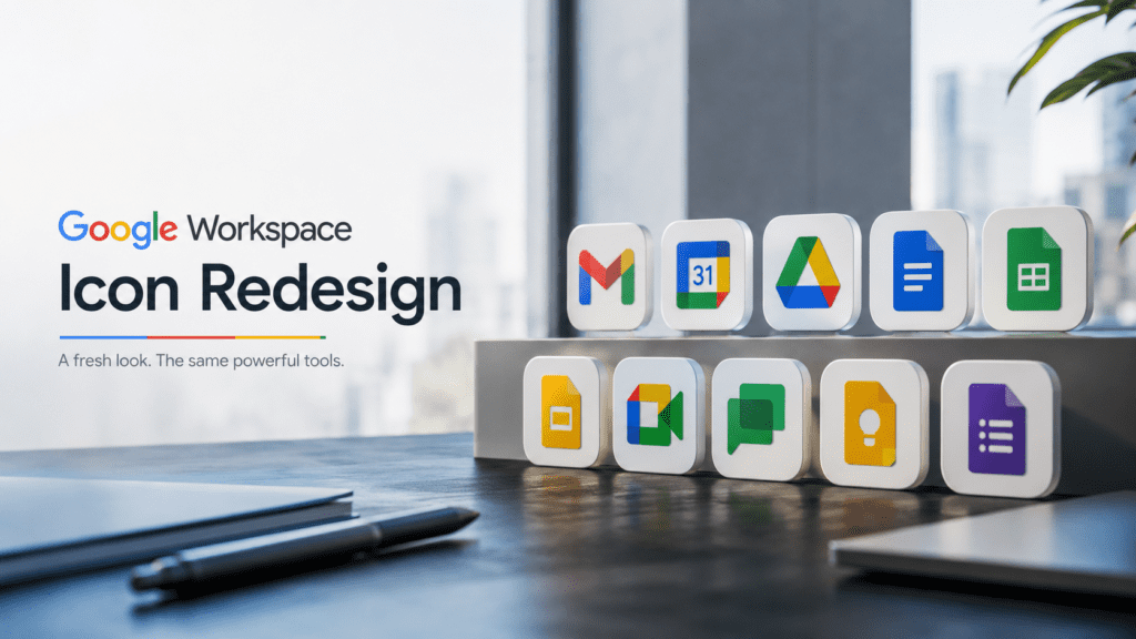
What Changed in the New Google Workspace Icons?
The redesign introduced several noticeable changes.
Shared Color Palette
Perhaps the most discussed change was the increased use of Google’s four core colors.
Previously:
- Docs was primarily blue
- Sheets was primarily green
- Slides was primarily yellow
After redesign:
- Most icons incorporate multiple Google colors
This created a stronger visual connection between products.
Simplified Shapes
Many icons were simplified into cleaner geometric forms.
The redesign reduced unnecessary visual complexity while maintaining recognizable silhouettes.
Examples include:
- Gmail’s envelope becoming a multicolor “M”
- Calendar adopting a cleaner geometric style
- Meet integrating Google’s color system
The result feels more modern and scalable across devices.
Greater Visual Consistency
Spacing, line thickness, curves, and proportions became more standardized.
This consistency improves harmony across:
- Mobile apps
- Desktop software
- Browser interfaces
- Marketing materials
The Psychology Behind the Redesign
Design decisions often influence behavior in ways users never consciously notice.
The Workspace redesign leverages several psychological principles.
Brand Association
Humans naturally group visually similar objects together.
When products share color systems and design structures, users perceive them as related.
This strengthens ecosystem identity.
Familiarity Through Repetition
Repeated exposure to Google’s signature colors increases brand recall.
Every interaction with Workspace reinforces Google’s broader brand presence.
Cognitive Mapping
Users create mental models of digital environments.
A unified icon system can help users understand relationships between applications.
Google is effectively signaling:
“These tools work together.”
That message is communicated visually before any user reads product documentation.
Why Some Users Criticized the Redesign
Not all feedback was positive.
Several concerns emerged shortly after the rollout.
Reduced Visual Differentiation
The most common criticism involved app recognition.
Under the previous design:
- Blue often meant Docs
- Green often meant Sheets
- Yellow often meant Slides
The redesign introduced more shared colors, reducing immediate differentiation.
For power users managing dozens of tabs or applications simultaneously, this created friction.
Many users reported needing additional time to identify apps visually.
Transition Costs
Humans are creatures of habit.
Even beneficial design changes can feel disruptive initially.
Users who spent years relying on specific visual cues suddenly had to relearn app identification patterns.
This temporary decrease in efficiency generated understandable frustration.
Similarity Fatigue
Some design experts argued that excessive consistency can reduce uniqueness.
A product ecosystem still benefits when individual applications maintain strong identities.
Finding the balance between cohesion and differentiation remains one of the biggest challenges in design systems.
Expert Analysis: Was the Redesign Successful?
From a strategic perspective, the redesign largely achieved Google’s objectives.
The company successfully:
- Unified Workspace branding
- Reinforced ecosystem thinking
- Strengthened association with Google
- Modernized iconography
- Improved design consistency
However, success depends on the metric being evaluated.
If the goal was brand consistency:
The redesign was highly successful.
If the goal was immediate app recognition:
The redesign introduced trade-offs.
This illustrates a common reality in product design:
Optimization in one area often creates compromises elsewhere.
Google prioritized ecosystem identity over maximum icon differentiation.
Whether that trade-off was worthwhile depends largely on user perspective.
How the Redesign Fits Larger Technology Trends
Google is not alone in pursuing visual unification.
Many technology companies have adopted similar strategies.
Industry trends include:
- Design system standardization
- Cross-platform consistency
- Ecosystem branding
- Simplified iconography
- Scalable visual identities
As software ecosystems grow larger, companies increasingly prioritize cohesive branding over isolated product identities.
The Workspace redesign reflects this broader industry movement.
Practical Examples of the Redesign’s Impact
Enterprise Adoption
Large organizations often deploy multiple Workspace applications simultaneously.
Unified branding can make employee onboarding simpler because products feel connected.
Mobile Productivity
On mobile devices where screen space is limited, consistent icon systems improve visual harmony.
Cross-Application Navigation
Users frequently switch between Gmail, Meet, Calendar, and Drive.
The redesign reinforces these workflow connections.
Common Misconceptions About the Google Workspace Icon Redesign
Myth 1: Google Changed Icons Only for Aesthetics
Reality:
The redesign was part of a broader Workspace strategy involving collaboration, branding, and ecosystem integration.
Myth 2: The New Icons Are Less Functional
Reality:
Functionality of the applications remained unchanged.
The redesign primarily affected visual identity.
Myth 3: User Complaints Mean the Design Failed
Reality:
Initial resistance is common in major interface changes.
Many successful redesigns receive criticism during transition periods.
Myth 4: All Modern Icons Must Look Unique
Reality:
Modern design often balances uniqueness with system-wide consistency.
Both goals are important.
Best Practices for Users Adapting to the New Icons
If you still find the icons confusing, several strategies can help.
Organize Frequently Used Apps
Pin essential applications in consistent locations.
Muscle memory often compensates for visual changes.
Use Labels During Transition
Enable labels in app launchers where possible.
This reduces recognition errors.
Focus on Shape Rather Than Color
Many Workspace icons maintain distinctive geometric structures.
Learning shapes can improve identification speed.
Allow Adjustment Time
Research consistently shows that users adapt surprisingly quickly to interface changes.
What feels unfamiliar today often becomes automatic within weeks.
Google Workspace Icon Redesign: Pros and Cons
| Pros | Cons |
| Stronger Google branding | Reduced visual differentiation |
| Unified ecosystem appearance | Initial user confusion |
| Modern visual language | Learning curve for long-time users |
| Better cross-product consistency | Similar color usage across apps |
| Scalable design system | Less unique app identities |
| Supports Workspace strategy | Recognition challenges for some users |
Key Takeaways
What Google Wanted
- Stronger Workspace identity
- Better ecosystem recognition
- Consistent branding
- Modernized visuals
What Users Experienced
- Cleaner design
- Greater consistency
- Temporary recognition challenges
- Mixed reactions regarding usability
What the Redesign Represents
- A shift from standalone products to integrated productivity ecosystems
- Increased emphasis on brand unity
- Evolution of modern design systems
Frequently Asked Questions (FAQ)
Why did Google redesign Workspace icons?
Google redesigned Workspace icons to create a more unified ecosystem, strengthen brand consistency, and reflect the growing integration between productivity applications.
Which Google apps received redesigned icons?
Several Workspace products received updated icons, including Gmail, Drive, Meet, Calendar, Docs, Sheets, Slides, and related collaboration tools.
Did the redesign change app functionality?
No. The redesign primarily affected visual identity and branding. Core functionality remained largely unchanged.
Why do the new icons use similar colors?
Google adopted its signature four-color palette to reinforce ecosystem cohesion and strengthen association with the Google brand.
Why were some users unhappy with the redesign?
Many users felt the icons became harder to distinguish quickly because multiple apps began sharing similar colors and design elements.
Is the redesign considered successful?
From a branding and ecosystem perspective, many design experts view it as successful. From a rapid-recognition perspective, some trade-offs remain.
How long does it take users to adapt to new icons?
Most users adapt within days or weeks as familiarity develops through repeated use.
Does the redesign reflect broader industry trends?
Yes. Many technology companies are moving toward unified design systems that emphasize ecosystem consistency and cross-product branding.
Will Google redesign Workspace icons again?
Future refinements are likely as Google’s design language evolves, although major redesigns typically occur only after significant strategic shifts.
What is the biggest lesson from the Workspace redesign?
The redesign demonstrates that icon design influences branding, recognition, user behavior, and perceptions of product ecosystems far more than many people realize.